From Green to Magenta is the third lesson learned at WIAD Bucharest 2015 and it’s all about Cosmote’s new website. Grapefruit’s case study shows what it takes to create happy user experiences. A clear development process covering steps such as business analysis and workshops, prototyping and design, content strategy, (re)defining internal processes and so much more.
“You think you know a story, but you only know how it ends. To get to the heart of the story, you have to go back to the beginning”. (King Henry VIII, The Tudors TV Series)

That’s the perfect motto for Telekom case study! Alecsandru Grigoriu (Lead UX) and Ciprian Boiciuc (UX Designer), my former colleagues at Grapefruit, have shared for the first time ever. Business analysis, user persona, wireframes, user journeys, responsive, content, user testing, sleepless nights and great partnership, you name it, this story has all ingredients to really impress you.
Objectives, requirements and assumptions
This is the story of a project developed in almost two years. It involved hundreds of people and thousands of business and tech requirements pages. Just to make it very clear, this project was not just about a new user interface. It covered everything; front-end to back-end development, UX/ web design, information architecture, content strategy, quality assurance, real-life user testing and more. It meant developing and implementing a new e-commerce solution with a user interface to accommodate:
- Cosmote’s plans and services
- Fulfilling customers’ needs
- Creating and managing content the right way
- Re(defining) internal business and tech processes
- Aligning internal and external stakeholders
- Risk assessments and conflict management.
Looking back, I would say it was a real change management project. I was lucky enough to be part of this story for almost 2 years. So, while reading this post, you’ll come across some personal insights shared for the first time.
No great UX is born overnight
Whether you are working on client or agency side, you must probably know by now that selling information architecture, user experience or content strategy can be quite challenging. Especially when you lack an educated internal or external client context.
I know this quite well! I spent around ten years of my life building e-business departments for different types of organizations. Other people know it too. They also made these journeys both possible and successful. Yet, there are many more who need proof that building a digital project capable of generating real business results cannot be done either overnight, or without careful planning and a well-defined process.
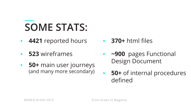
I should add that besides the 4421 officially reported hours, there were another few hundred unreported by the agency and few more thousands on the client team’s side. Not to mention another a few thousand with the platform integrator.
Commitment to change
“Change starts when someone sees the next step.” William Dryton
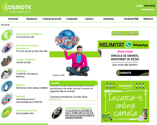
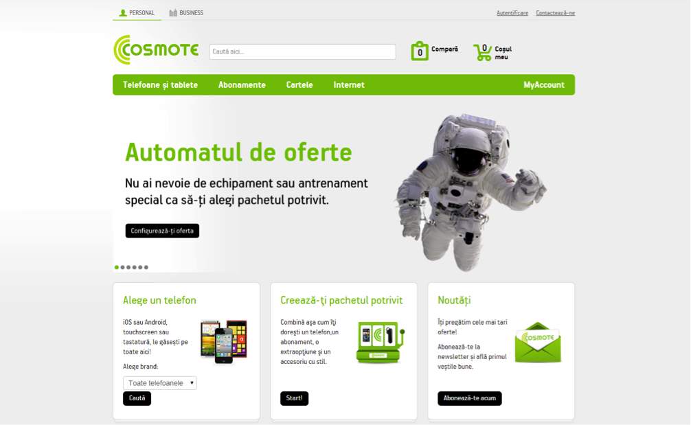
Let’s go a little bit back in time, November 2012 to be more specific. Cosmote.ro website looked like it was a record from the Internet Archive. Cosmote leadership decided to make a radical change in the way it approached the online services.
This is how Cosmote.ro homepage looked like back in 2012. Too bad I do not have more images of how other content pages! 🙂
It was no secret! Everybody knew it—the users, the Client, the Agency. Cosmote.ro was far away from what the competitors offered. It did not reflect well on the brand values. Also, it did not offer all that users actually needed. Updating the site was a challenge for the internal team. Therefore, it was no wonder that all parties wanted a new Cosmote.ro website. A useful website great that would reflect the brand values, solve users’ problems and offer them a great user experience. The team had a great advantage in making this happen. Someone who clearly saw the next steps … and very supportive top management team.
While working on the project, there were many cases when we realized that we had to find a way to fit many new deliverables to the initial project planning. Lots of additional user journeys and new functionalities, page templates nobody realized we needed. If it weren’t for the commitment of all the people across departments, this would not have been possible.
Winning with a strategy
In autumn 2012, following a well-organised and transparent pitch, Cosmote/ Telekom team put its trust in Grapefruit to design the user interface for the ATG e-commerce platform.
There were few people who for various reasons did not give Grapefruit a chance at winning, yet we did, and it was not for our humour (although later on, it proved to be quite useful when facing critical situations). What made the difference was a not a 100 pages coloured presentation, yet a well-thought strategy, a driven senior team with an excellent track record, extensive research, great inside-out understanding of telecom industry and client-agency chemistry.
The proper development process
One of the major topics Grapefruit team underlined even before starting working on the project was the importance of having and respecting a clear development process for it’s one of the most common reasons for failure. I’m not going to go through all details of the project, yet I’ll only review them briefly:
Stakeholder Workshops & Business Analysis
Without this first major step, no project can be delivered successfully. It involves people across Telekom departments and requires a mandatory mindset for change. It’s that time when parties get to know each other. They set clear project objectives and look carefully. They prioritise internal and external customer needs. And also, do their best to understand human and technical project constraints.
User Persona
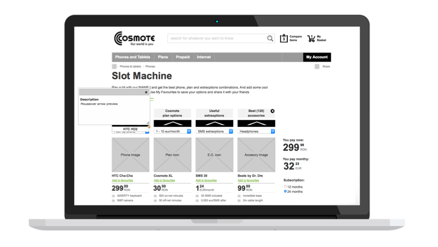
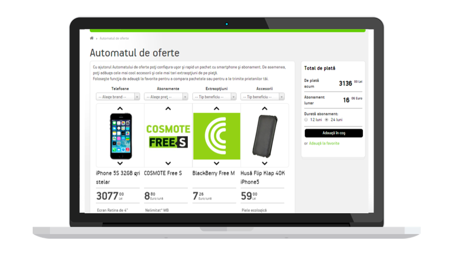
Describe real people with backgrounds, goals, and values and when well-defined, they give a clear picture of the user’s expectations and needs, as well as how they’re likely to use the site; personas are only as good as the research behind them and in this case the Client did a great job at putting together all quantitative and qualitative research data; consequently, later on, they helped us identifying and creating various features and functionalities; slot machine is just one great functionality example developed for Miron.
Prototyping and design
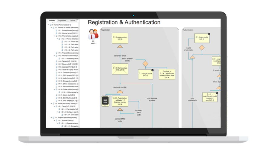
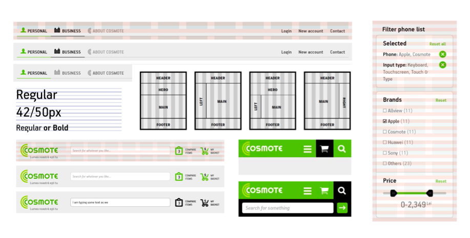
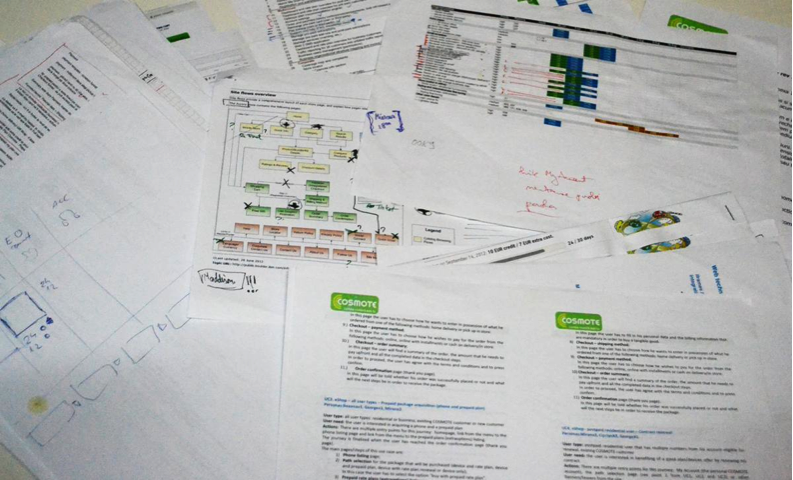
With all the information gathered and clarified, we all moved to the next phase, the design itself; ensuring a proper information architecture played a key part as we had to make sure that users, no matter how technically skilled they are, find exactly what they are looking for; Axure was the right tool to show and get client’s feedback on the main site components (e-shop, myAccount and tens of corporate page templates).
Content strategy
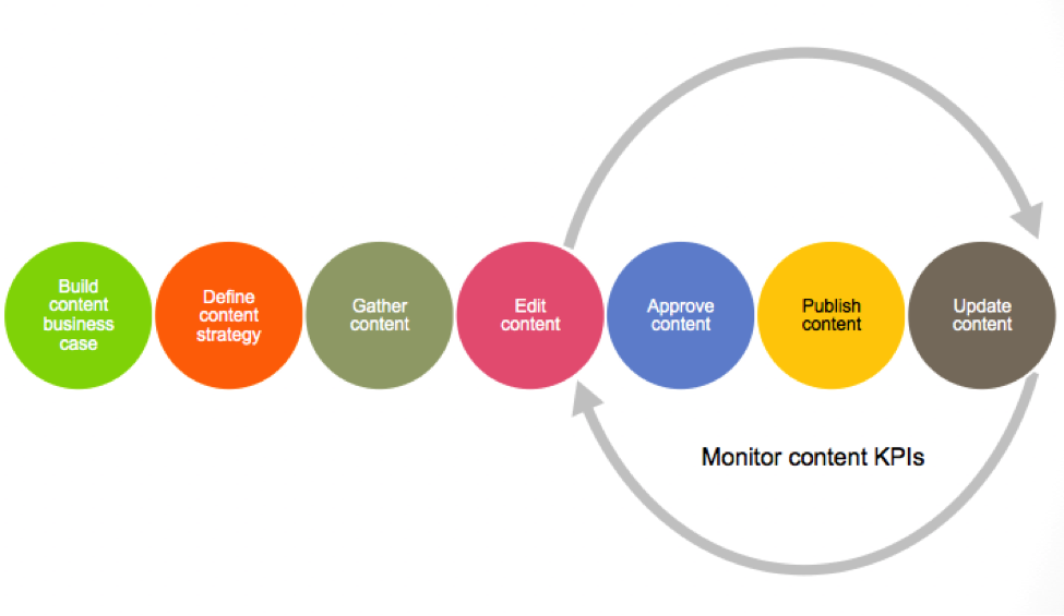
It’s no secret that great user experience is achieved through content, branding, functionality and usability ensures. Unfortunately is content that most often gets ignored, so selling it to key stakeholders was a major priority from the start. It was no easy task, to tell you the truth, but that did not stop us. When putting numbers behind it and proving the risks of ignoring it using real-life examples, things do happen for the better. Therefore a dedicated team took over the responsibility of gathering, writing, approving and publishing it.
User testing
This new project stage required by the Client was the first true test for the entire project team; so many months of hard work were submitted to the most difficult test of all, one of the real users. The feedback we had from over 60 users who tested various user journeys exceeded our expectations.
Still, we had some unexpected surprises! Some did not see the compare product link although it respected Nielsen’s best practice recommendations. Roxana, our least technical persona was able to use the slot machine without any help. If you want to find out all the details read Redesigning Cosmote.ro story published on Grapefruit website.
Launching Telekom
The new cosmote.ro was launched and with it came another piece of big news. Deutsche Telekom will enter the market and Cosmote and Romtelecom website will join forces under Telekom brand. So, the new Magenta chapter opened with a newly reorganized Client team and a tight deadline to meet.
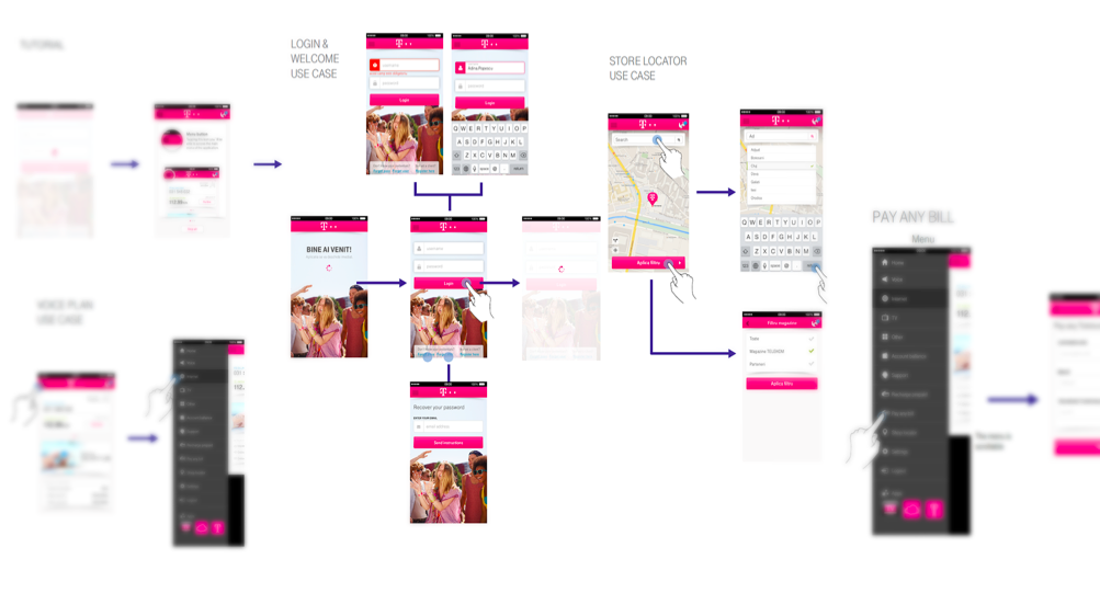
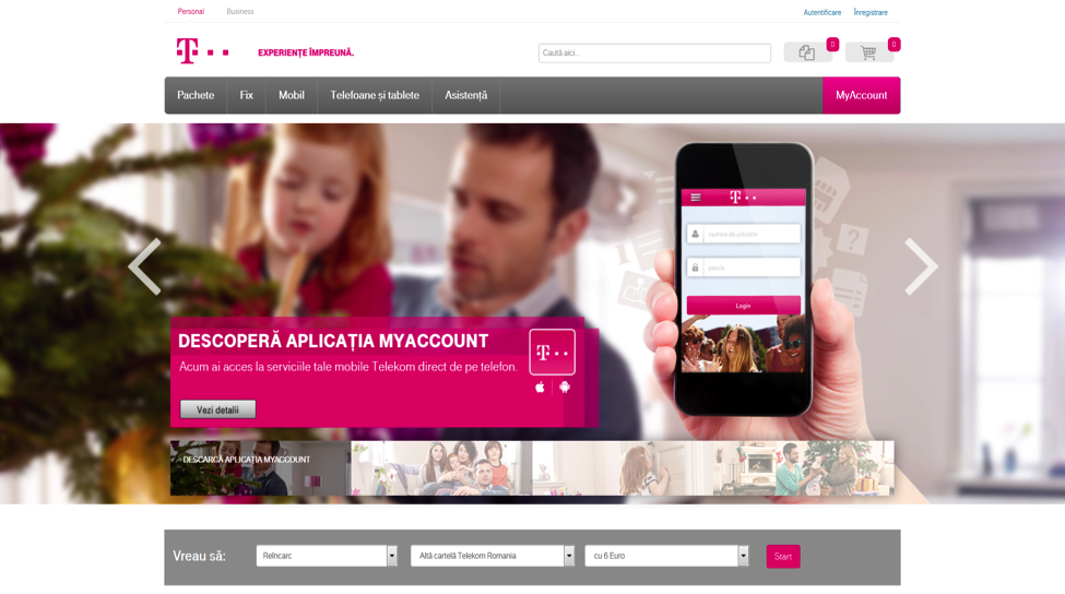
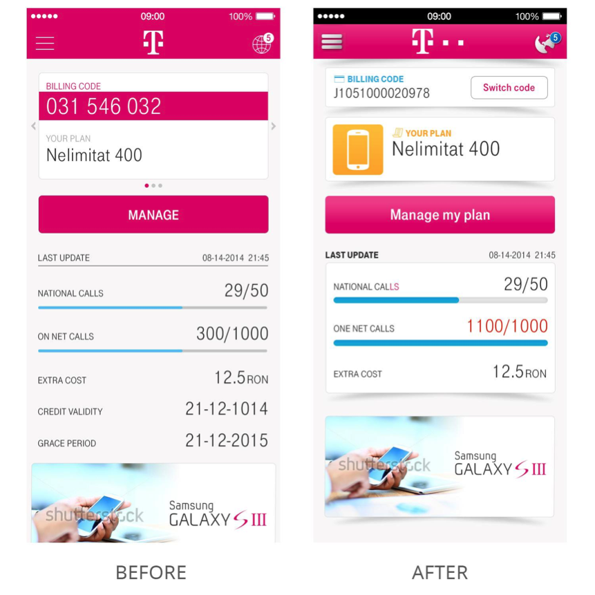
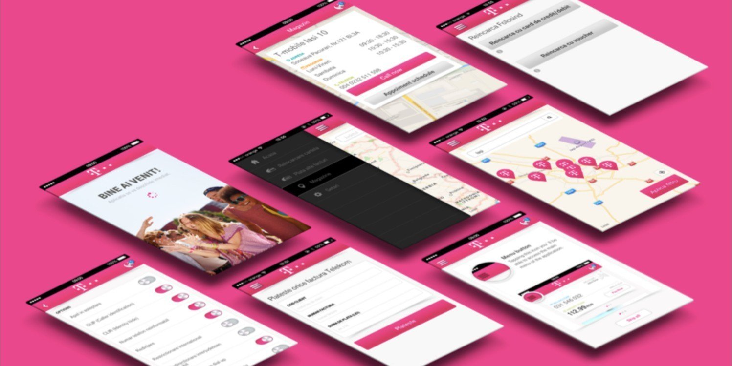
In case you’ve missed Grapefruit’s presentation at WIAD2015 Bucharest, read Designing Telekom.ro article published on their website. Designing the Telekom MyAccount App is the third chapter of this story. It was followed by one of the most innovative rebranding media campaigns in the past years of the advertising industry in Romania.
Conclusion
When passion and commitment hold together the team
This project was the second ATG implementation within the Deutsche Telekom group. As far as I know, it still holds the record as is the most successful one. If I were to pick one single value shared by all these amazing people who made this project happen had in common, this would definitely be passion.
KUDOS and a big THANK YOU for to:
- My former colleagues and friends at Grapefruit — Elena Jigaila, Anca Teletin, Andreea Marinciu, Alecsandru Grigoriu, Ciprian Boiciuc, Marius Ursache, Alexandru Cahnita, Eddie Vlagea, George Pogorelschi
- The awesome team at Telekom – Cosmote – Romtelecom — Elena Dragoi, Madalina Gheorghiu, Amy Paris, Adriana Tarba, Edina Constatinescu, Yannis Kapsoulakis, Dragos Florescu, Bogdan Jelescu, Adina Balaban, Gabi Iacob and Stefan Anghel.
Without you ALL, this wouldn’t have happened. You made this journey amazing!


